
Allow users to pre-book upcoming tryouts, sync tryout schedules to Google Calendar, and receive notifications when the tryouts are available.

About Zenius
Zenius Education is an Indonesian edu technology company offering online learning platform. The platform offered learning live classes, learning videos, practice questions, and so on.
The issue
Two of the reasons for not trying the UTBK tryout are that users were not aware of the available tryout, and they were not confident enough to take it.

Issue 1: Users were not aware of ongoing or available Tryout
There were 2 types of Zenius Tryout:
Scheduled Tryout= Timed tryouts held at specific dates and times. Designed to simulate the actual exam conditions.
On-Demand Tryout= Flexible timing. Can be accessed anytime and anywhere.
The previous design used a tab layout with the main tab displaying Active Tryouts. However, Active Tryouts are not always available and depend on the schedule. As a result, when users arrive on the Tryout page, they often encounter an empty state due to no active tryouts (see image below).


Issue 2: Users were not confident to take Tryout
For this issue, I questioned, 'Why did users feel this way? What were their feelings and actions before or during their preparation for the UTBK?'. Since I never took the UTBK myself, I conducted a mini-research by simply asking four students who had taken the UTBK.

Question 1: What did you feel when you knew you were aiming for state universities, meaning you would have to take the UTBK exam?


Tryout users characteristics
Based on the quick mini-research above and the survey that Zenius Researcher ever conducted, I got the picture of the characteristics of Tryout users. *Note that this is based on my opinion, intended to equip and familiarize myself with the user characteristics of the product I am building.
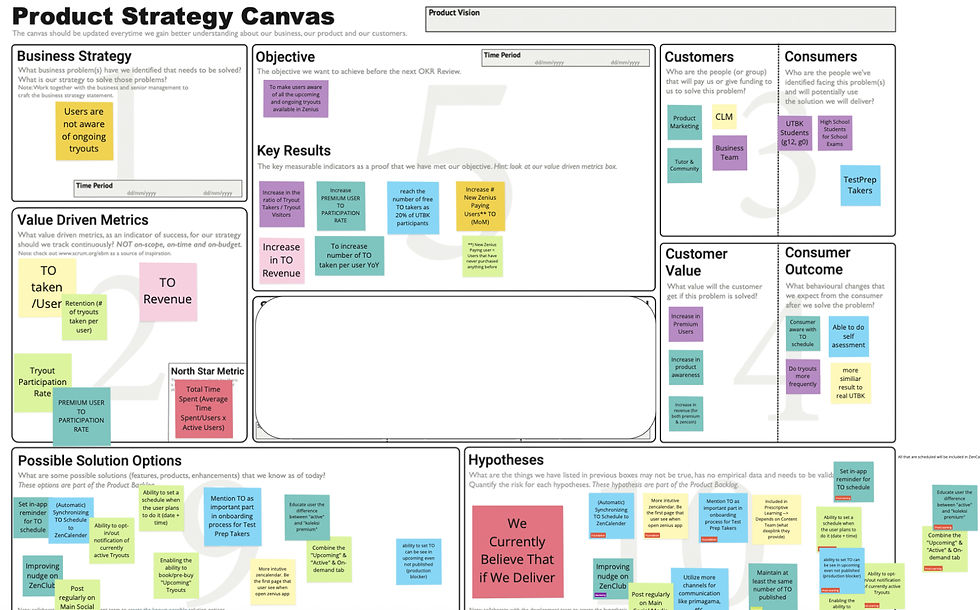
We had a brainstorming session that included the Product, Learning, and Marketing teams. We identified several possible solutions. I developed wireframes and went through multiple rounds of iteration.
Brainstorming

Redesigned Tryout main page using a vertical accordion list to allow users to immediately see the upcoming tryout when there are no available tryouts. When there are no tryouts available at all, encourage users to practice using the ZenPractice feature.
Possible solution Issue 1
To improve Tryout visibility:
-
Avoid showing an empty state as much as possible. If there are no available Tryout, display upcoming ones (better tab organization for active, upcoming, etc.).
-
Allow users to book or pre-purchase upcoming Tryouts.
-
Set in-app reminders for the Tryout schedule.
-
Synchronize with Google Calendar or ZenCalendar.
How might Tryout Zenius
-
Increase its visibility?
-
Motivate users to take as many Tryout as possible to boost their preparation?
-
Provide guidance and practical tips about the exam?
Next project

What is Tryout?
"Tryout" is a practice test or series of mock exams that students take to prepare for official standardized tests like the "UTBK" (Computer-Based Written Examination). UTBK is a critical exam for the admissions process for entering state and favorite universities in Indonesia.

Question 2: What was your first action or step in preparing for the exam?
Result
The new design resulted in a 90% success rate and positive user feedback during testing. However, the revamp has not been further developed due to company conditions.
Some interesting feedback from users includes:
-
Users love having their dream university on the main page of Tryout; some suggested providing motivational words to encourage them further.
-
The use of orange color for negative tryout results felt positive for some users. One user mentioned, 'having orange here makes me feel appreciated, not failed. Maybe because we’re so used to the intimidating full red screen of UTBK results.' It surprised me how colors can affect users' psychology.

Showcased Zenius blog content about UTBK information and tips and tricks to help users who are clueless or feeling unmotivated. Additionally, I used friendly colors for the negative tryout results; instead of using red, which gives the impression of failure, I used orange.
Possible solution Issue 2
To motivate the unconfident & clueless users:
-
Provide Zenius' existing blog content about UTBK (e.g., guidance, tips, and alumni stories).
-
Use supportive copywriting and friendly illustrations.
-
Show a progress chart.
-
Link to learning recommendations based on users' Tryout results to improve users' competency.
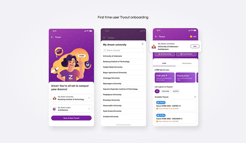
Moved the university dream selection to the Tryout onboarding process and kept it on the Tryout main page so that users will always be reminded of their dream. Previously, the university dream selection was placed before users took a certain tryout. Moving it upfront also helps avoid repetition in selecting a university dream each time they want to start a tryout.
Prototype
Semi-full prototype of Tryout 2.0:

Zenius Education — 2022
Tryout 2.0 revamp
The goal of this project is to increase Tryout retention among low and medium users.
Key skills developed during this project: